Showing posts with label technique. Show all posts

Sunday, January 17, 2021

A Year of Experimentation, Take 2

 Last year was supposed to be me experimenting in the studio as I healed from ME/CFS and explored what I could do within my physical limitations.  Then, well, 2020 happened.  

So, I'm picking up where I left off when my back went kablooey in August by taking some baby steps this month.  Normally, back recovery from a serious blowup takes 6 months so I am being careful as I start up my studio time again.

I'm still working with Alcohol Ink and will be using the lovely little tool kit I bought to play with marbling and other fun color swirling.


I've been watching videos and reading in the FB groups dedicated to the lovely inks so I was already looking at silicon brushes with interest.  Then Mighty Girls had a post about the above mandala painting kit and I checked it out.  Very good price for all the extra stuff that comes with the silicon brushes.  I start tomorrow with playing with these new tools and seeing how the ink behaves when manipulated.  

Wednesday, November 28, 2018

Developing new dancer piece

We had a lovely vacation in Canada the week before Thanksgiving and then went to our daughter's house for a small Thanksgiving dinner and amidst all of that, I have neglected the blogging.  Part of that is feeling like I didn't really have anything concrete to write about.  Vacation was a very relaxing time with lots of short walks along the bay and talk about books we're reading but I left my camera battery plugged in at home so my usual vacation blog about birds would have had no photos.  Altho I did take some interesting textural ones with my phone but talk about those will probably happen when I actually do something with them.

And Thanksgiving week was all about recovering from vacation and downtime with the family.  No big events there either.

So I almost did a book report this week.  Fortunately for all of you, I did start work on a new dancer piece using my new poseable figurine to give me some shots to work from.  I actually posed her on vacation and was very happy with how easy it was to photograph her with my phone.  That was the whole point of getting the gray rather than the flesh tone figure since it would give me an almost black & white silhouette to start with.


Once I got home and had uploaded my camera photos via Dropbox, I popped the picture into Photoshop for cropping and color shifting a bit.  Then printed it out and did a tracing with my trusty brush tip marker giving me this nice silhouette.


But wait, there's more.  This gives me the first silkscreen I need so I can lay down the background color for the dancer.  Next, I need the dancer silhouette with the body art so I pulled out some of my spiral screens & stencils and played around and got this. 


Unlike my earlier dancers, I stopped the tattoos below the arms.  When I tried them on paper in b&w I really didn't like the loss of detail for the face and arms so I went with this look.  Now, I've printed this out in multiple sizes and am ready to make my silkscreens to try out my new composition.  I should have some colored versions on paper by next week.  I am really happy at how quickly this process went as this makes it much easier to do composition changes and variations. And that means I get to focus my time & energy on the color play which is my fun place. 

Monday, December 19, 2016

Soy wax fun from Jane Dunnewold

I've been playing around with Jane Dunnewold's techniques for using soy wax since her book, Vibrant Color, came out.  The painful part was always making the soy wax paste that can be used for a big variety of surface design techniques, including silkscreening, my particular interest.


Well now, Jane has come out with 2 different packages of premade soy wax paste.  So if you've been wanting to try some of these things out, but didn't want to invest in all the equipment to do it yourself until you'd experimented a bit, here's your chance.  Order before Dec 31 and get free shipping and an ebook version of the book above.  I have no financial interest in her success, just another artist who loves her clarity in explaining things and shares some of her interests.

Order here:  http://www.janedunnewold.com/soywax/

I'll be experimenting in this area in the next few months, in and around getting ready to move to Bellingham, and of course, I'll share pictures of what I do.  Happy Holidays to all who are celebrating now!

Wednesday, March 23, 2016

Watch another fiber artist in action

I'm down with the flu, again!, and thus have no work to share this week so here's a link to show what another (now local) fiber artist has done lately.  Carol Bryer Fallert-Gentry has documented Fossil Fantasy from idea to finished art piece here.  I'm looking forward to watching the whole thing as I feel up to it.

click for next image

Monday, January 11, 2016

Long desired Marbling book arrives: Shiny squared!

Today was not a studio day.  First, I woke with an awful headache which has spent all day hovering on the brink of migraine despite every medical bullet in my inventory.  But... a really great thing happened.  A wonderful art book about Turkish marbling written by Hikmet Barutcugil arrived.  I got an empty box with a note for Xmas saying it was on it's way from Turkey.  And it came today.  Just when I really, really needed to just sit and read.  How nice!

Front cover
inside cover & dj flap


I particularly like that he has experimented with pushing the bounds of traditional marbling going well past the traditional techniques.  This book covers those traditional techniques and some of the blendings.   What is great about it is the information covering the why of the techniques which is what I need to do my own experimenting.


 While I like the non-geometric traditional work, like the blue sample above, I really love the pieces where he combines wavy marbling with traditional art elements.  


The other wonderful thing about the book is his philosophy on the spiritual side of marbling.  I had no idea he thought that way.  Which is interesting, considering I've decided to use marbled fabric to represent the flow of the universe/spirit in my work.  Synchronicity rules!

Saturday, January 9, 2016

More blue dragonflies

Today, I figured out what sets of paints I want to test and laid out my different fabrics to work with.  I screened blue dragonflies on the dark green cotton and the 2 silks.  Then I painted using the paint set I used yesterday.

dark green cotton
  
The paint didn't flow as well on the 2 hand dyed silks and I realized I should change the color on the tail that alternates with the gold when I change the background color.  On these silks, it should really have been a green rather than the russet I used.

purplish silk


variegated chinese red silk

Painting these 3 dragonflies took about 75 minutes.  There were lots of small bits where I had to use a tiny brush so it took a fair amount of time.   I think the other paint sets will go faster as I gain practice in painting multiples at one time.  I'm looking forward to seeing how the samples come out.


Wednesday, January 6, 2016

First 2 painted dragonflies are done

Progress today was good but not what I expected to be working on.  I finished silkscreening the fabric I had already sized and pressed.  I got one test of Setacolor shimmer vs transparent paint done.  Since I'm still reacting to the studio air, and I didn't have the painting supplies to make other test, I spent the rest of my work time today watching a class on Skillshare (Mastering Inking).  I hope this will be relevant when I get to working on the dragon drawing.

For tomorrow, I have *lots* of silkscreened dragonflies in various colors to do the paint experiments with.
all screened with metallic paint


The little paper plate above is what I used as a palette for the mixing of transparent Setacolor with matte medium.  I did this to increase the transparency of the paint.  The big gold/green blob on the plate is watercolor gold mica mixed with thinned medium and textile medium.  I used those paints on the smaller dragonfly.  The bigger dragonfly was painted with the Setacolor shimmer opaque fabric paints.

transparent vs opaque fabric paints

The painting lessons learned for today are:  1) even with a teeny brush the opaque paints are more time consuming to use if I want to keep the silkscreened lines.  2)  the shimmer doesn't really show so probably not worth the time/effort to use the opaque paints.  3) the transparent paints work great with a larger brush and go on quickly & easily while still showing the silkscreen lines well except for the tip of the tail where I used a blue that was too close to the blue of the lines.

Looking forward to some extended painting tomorrow alternating with some more info about brushes, inks and brush strokes from Skillshare.

Tuesday, January 5, 2016

Handling the unexpected aka the challenge part of a challenge

Today I went in and quickly cleared the area in front of the sink before lunch.  As I got closer to the wall, I discovered that it is a bad idea to lean a big piece of plastic against the wall and then close up the basically unheated room for a few weeks while there's company visiting.  Condensation, closed space, well, not nice.  After a vigorous scrub with alcohol, and the beginning of some serious sneezing due to my mold/mildew allergy, I realized I was going to have to revise my expectations for my day.  So, I made lemonade.  I grabbed some of the fabric, a box of the paints, my favorite brushes, and the padded board I like to work on with silkscreening, moved the UV light air filter fan into the studio and closed the door.    Resulting in this folding table with a view of the backyard bird feeders.

minimal workspace with a view

Then I broke for some allergy meds and lunch.  This meant a late start on the silkscreening and painting but at least I was still making progress.  I started with the t-shirt and discovered that the Setacolor shimmer colors lose most of the shimmer when dry brushed on lightly.  I decided to switch to another fabric for trying out the paints.


tshirt with orange & gold on big dragonfly

Since I have a request for the dragonflies on dark fabric, I decided to see which dragonflies worked best on the dark fabric with the various metallic silkscreen paints I had in my box.  Here's the result with the medium size dragonfly from the t-shirt.  On the t-shirt, this was done with a non-metallic paint.  Here, I used silver on the top 2, red and gold on the middle 2, and the bottom was peach and bronze.  This dragonfly has very thin lines and doesn't work very well with the metallics.  Altho, looking at the picture now, I can think of times I might want the almost ghost image of the dragonfly that the bottom pair turned out to be.


thin lines

The final tryout repeated the darker fabric with a larger dragonfly and the 3 most successful colors from the one above:  red, gold and silver.  Looking good! Crisp lines and good paint density from the silkscreens.

Ready to paint

Results from today:  I wrote on the folder for the medium dragonfly to not use it with metallics.  Way too iffy on the results.  And I got out the transparent medium and the Speedball pearlescent base to see if I can get the slightly glittery translucent tone I am looking for with the painting.  I also ordered some mold/mildew remover/sealant which should come sometime tomorrow.  That means tomorrow  I will be continuing to work on the folding table and my goal is to paint all the dragonflies I screened today.  If I get all that done and still have work time, I'll start working on sketches of dragons.


Saturday, January 2, 2016

Art Experiments Challenge or what I'm going to be doing in January

As I explained yesterday in the 2015 wrap up, I am going to be blogging daily about my studio experiments.  Today, since my studio currently looks like this:

Today's work: clearing room for experiments!

I'm going to talk about what I want to achieve and how I'm going to approach it.

Primarily, I want a faster, less physically challenging way to create work.  Part of figuring out what that means was re-reading How to Get Focused and Create What Matters by Dan James.  This is one of those books that I need to reread periodically as this is an issue I struggle with.  (My friend Lisa says I suffer from project interruptus.  I say I have a low saving roll against shiny.)  And I like his approach to pricing it.  What could be better than picking what you pay for an ebook?  See his page about the book here.

What did I re-learn from the book?  I have to focus on one project at a time.  This does not mean I can't have more than one project in progress, but that I need to put all of my attention on one while I'm working on it.  Go into that flow state.  For me, this means only 2 projects at once and different spaces for them.  I definitely need to declutter the studio to start!  And I need to trust that my most important ideas will insist on getting done so I don't need to spend time dithering about which idea I should work on now.

Given those, I then started my list of experiments which will undoubtedly change as I go.  That is the way the whole experimental process works after all.  So this is essentially a place to start.  I learned from my chicken project that I wanted to head more toward making my own fabrics.  And I need to reduce the number of steps in my process which also probably means reducing the number of techniques I use.  My first step will be experimenting with silkscreening.  Can I use silkscreening to create my own fabrics with textures I like?  How about doing some batik style patterning?  And combining the silkscreens with painting so that I use silkscreens as outlines, kind of like a coloring book.  And what about dye painting?  I have a formula for making a soy wax cream with dye in it and it works well with silkscreens.  Definitely want to play with that.  And finally, I have 2 household projects I want to work on that I will use as a focus for the topic.

To put it in list form, experimental starting points:

  1. silkscreening and over painting
  2. silkscreening with soy wax cream
  3. Textures on fabric
  4. soy wax silk screening and dye painting combined
  5. faux batik (with discharge?)
  6. Dragons & birds, especially using my photos of local birds as a starting point

Here's a t-shirt from my drawer of not quite right things that I will be using as a starting point for experiments.  And yes, it's not dragons or birds but this is all experimental so I'm starting with what I have.

Tiedyed tshirt with silkscreened dragonflies

Tomorrow, I'll be overpainting the dragonflies on the t-shirt.  And probably creating more dragonflies to try out different paints and different techniques.


Wednesday, April 2, 2014

Frugal marbling tools

As I continue my marbling adventures, I find myself needing a variety of different tools, called rakes or combs.  These are the things used in marbling to make fine lines and curves of the paint on the marbling medium.  By using these in sequence and in different directions, the various traditional marbling patterns are created.  The patterns I want to use as a base for my marbling drawings require some of this traditional patterning.  Here's the final stage of my most recent experiment with the Nonpareil pattern as the starting point.  This was done using a hand-dyed silk hanky about 12" square and colored a medium-light blue with a greenish tint.  What I'm looking for is the curved feather that is most apparent in this pattern in the lower left and extending across the middle.


The above pattern requires 3 sets of rakes with different spacing for each set.  Each set is two rakes, one of each length to match the different sides of my marbling tray.  These rakes are also expensive when bought from supply stores because they're made of wood, with really good metal bits.  And they need to be the right size for the trays being used.  So, my frugal streak got creative and I have successfully made them from corrugated plastic sheeting or foam core for the bar part and T-pins or straight pins for the metal parts.


The black one on the left is some scrap foamcore cut about 1/2" wide and about 1/2 the spacing  less than the length of the tray.  The shortness is because the rakes are offset halfway going in the different directions.  The corrugated plastic is scrap from a friend's booth display and has the advantage of being waterproof.  These each took about 10 minutes to make with my handy cutting mat and ruler, and I can get the pricier version once I know what sizes and spacing I need to do the work I like.  For now, as I experiment and learn, this is a really quick and frugal approach.  


Saturday, June 1, 2013

Fun with Sumi, taught by Karen Dedrickson

Two weeks ago, I participated in Karen Dedrickson's dress rehearsal of her new class in exploring contemporary sumi painting.  I adore her birds, (see them here), and we are good friends, so I was thrilled to help her out and get to play with her techniques all at the same time.  We had a blast and I learned some things that I think will transfer well to dye painting on fabric.  Sumi painting is traditionally done with just black ink on rice paper and a particular style of brush.  These technical limitations mean that it's easy to focus on subtle variations in flow, brush use and shading with the ink by diluting it.

In keeping with that type of limitation, we used one of her owls as a starting point for our exercises and did 6 quick pieces varying one major thing per piece.  I was really pleased with the class and here are some of the owls I did.  (My daughter has already asked for one for her bird art wall.  What a compliment!)  Along with some comments about what I learned from doing them.

Here's the first bird.  My brush was loaded with lots of undiluted ink, so there's that really dark first stroke.  That led to my going with some darker imagery with the head/eyes.  Not one of my favorites but others like it best.  (Taste varies.  Really.)


This was the third of six.  I was trying out dry brush strokes with this one so it seems more energetic and almost frenzied to me.  Still going all the way to the edges which doesn't work so well when framing something.  (Karen has figured out how to help students with this earlier in the class.  Go, Karen!)
I like the feet on this one.


And my personal fave, the Buddha Belly Owl.    I went much smaller and was trying out prewetting the paper with dirty water.  Then adding more ink using dots over the earlier ones.  I'm not sure why the paper has wrinkled so much but that does add some interesting highlights to the belly area.


All in all, it was a great class.  Karen is knowledgeable and articulate and did a stunning job explaining things one on one with all the different people in the class.  I learned more about how hard it is to do the work she does and I learned some techniques I will be playing with on fabric.  In color, of course, since that's what I do but I can see new ways to approach my own work and that's a big thing to take home from a class.

Monday, April 1, 2013

Latest marbling experiment - what do you see?

So I spent some time in my studio playing with my new marbling ideas after getting everything all set up for the new show I talked about last post.  And I decided to try out using a stencil.  Great idea.  Unfortunately, I also forgot the "change only one thing at a time" rule, and decided to go ahead and try on hand-dyed cotton fabric with an alum presoak instead of the ready for inkjet white silk.  This is my tendency to change everything breaking free again, alas.

Here's one of the results, the one that came out the closest to what I was thinking I would get.  And I want to know, do you see a lotus blossom or a turtle?  Or just a big blueish purple blur?


So, back to the marbling bin and this time, just one change at a time.  Really, I mean it....

Sunday, October 14, 2012

Dye experiment - shades of gray

This month, my experiments in the studio are focused on shades of gray.  I'm doing some dyeing of new colors to use in some new collage pieces, and as scarves and pillows to sell in my etsy store, so there's been some trials.  One of my problems is that I like to work with silk and I'm using the Procion dyes that are formulated for cotton.  Why is this a problem?  Well, the dyes attach at different speeds with the different fabrics so what goes on as a fairly smooth gray on cotton, separates into the component colors on silk.  I usually like this effect but for my scarves/pillows, not so much.   I'm still working out the kinks, but thought I'd share my progress so far.

Here's a photo of the 6 levels of intensity which is my usual first experiment to decide how much dye to use for a particular size of fabric.  I did six levels,  essentially doubling the amount of dye per cup of water at each level so the leftmost fabric is very pale at 1/2 tsp of dye solution, and the rightmost is 8 Tb.   The purplish colors really shows the level of separation that occurs with this gray which is a blend of green & purple.


And here's my experiment with various ways of putting the fabric into the dye.  Scrunching gives more mottling (the leftmost one), folding gives a definite pattern and the rightmost one has the fewest folds and got patted flat and tilted so the dye moved around more often.  My photography wall is gray felt so this isn't the best way to show these samples, but I think it's good at showing the surface texture produced by the different ways of putting the fabric into the container.   The rightmost is the one I'll be trying to perfect as it's a lovely silvery gray with slight subtle mottling.


Saturday, March 17, 2012

An experiment with discharge paste

My "Business of Art" class is coming to a close, with just a couple of assignments to be finished off before graduation later this month. So, I've been hitting the studio and actually making things! What fun.

I started an experiment with Jacquard Discharge Paste this last week. I started with this fabric, which has a tendency to appear very dark and more uniform when photographed at a distance. Since that's the way I do the photography for show submissions (at least for bigger pieces), I'd prefer that the visual texture be more obvious. I also wanted to see what the discharge paste would do on a fabric other than black. Most discharge work I've seen and liked was on black because commercial black fabric is created by overdying and the discharge usually doesn't get all of the underlying color. But I digress....


The instructions say to paint the discharge paste onto the fabric. They also mentioned thinning it with water if you wanted less discharging. So, I thinned with water and then applied with a sea sponge as I wanted to maintain the visual texture the fabric already had. As you can see below, I didn't get as much of the texturing in the discharge as I would have liked, and it's a good thing I thinned it because it discharged to almost white.


I didn't want such a bright white, but more of a subtle lightening, so I overpainted the discharged areas with Cobalt Blue Setacolor transparent paint. I like the results and will be playing more with discharging and overpainting later. I will also share those experiments, so stay tuned!


Saturday, October 22, 2011

Stamp carving or another way to make my own fabric

In my ongoing search for ways to create my art without stressing my bionic knee or my herniated disc, I am playing with carving my own stamps to use in dyeing and batiking fabric, or adding images to already dyed fabric. I already have a lot of different dyes, fabric paints and silkscreening paint, so my new supplies list is pretty simple: carving tools and stamp material. Stampeaz has a nice sampler pack of stamp material so I started with that. And I got the 2.5 inch carveable brayer because the idea of the rolling image seemed fun. It's definitely something I can't do with a silkscreen. My local art supply store had a sale on the carving tools so after about $30, I was set to go.

I got my first image from Art Stamping Workshop by Gloria Page. I also watched her video which gave me really great tips on using the tools and how to make carving easier. Here's the stamp. I've used commercial batik fabric with spirals on it so I was very interested in doing something similar but with my own feel to it. This one started with a 4x6 block of stamp material.


Here's two images from this stamp. The one in purple ink was the first one. That's when I discovered that my eye was used to the lines I use in my silkscreen work and for stamping the lines needed to be thicker and stronger. I also didn't like the straight edges with all those curves so I shaped the edges as much as I could with the material left on the edge of the stamp. The black print is after the modifications. It came out much closer to what I was looking for.


I found this material pretty easy to carve. It's the Speedball beige stuff. Stampeaz mentions in the description they have for it that it can be crumblier over time. I'll try the other 2 materials I have from the sampler pack and see what I think. More about that later, as I get more carving time in.

Then I moved on to the brayer. I got the smallest one, which made it harder to hold onto it while carving. I didn't slice myself up, but I did slip and prick my finger a couple of times. Obviously some work to do here with the technique - probably both the holding and being more aware of my finger being in front of the carving tool's leading edge. Here's the brayer and how it did on paper in one picture. I missed inking all of it, so I filled the blanks in with blue ink so I could see where the gaps were easier. It was harder to ink the brayer evenly. The print pictured here was done with silkscreen ink spread lightly onto a paper plate.


I liked how this one worked to give me the continuous line of image, but the surface doesn't hold much ink so it fades fairly quickly. I will have to experiment to see how to improve this.

Next up, doing stamping with these stamps on fabric. Fun times ahead!

Thursday, February 19, 2009

Backyard Bushtits #1 finally finished

I've obviously been trying to go faster than my body wants, as I'm struggling with a cold in addition to the surgery recovery so it's taken me quite some time to finish up Backyard Bushtits #1. BUT, it's done, finished, even ready to hang and it will be put on my etsy store sometime next week.

I learned a lot from doing this work in a series and I'll post later about the rest of the pieces as they finish up. Right now there are 4 of them. I've put the word "LESSON" in caps throughout my post for the things I've learned.

Here's the photo I started with. The bushtits travel in large flocks, up to a couple of dozen little birds, and they tumble across backyards here in western washington. (Probably elsewhere, but I'm not motivated enough right now to go look up their range map. I leave it as an exercise for the reader.) I really liked the way the four of them looked like a puppy pile so I snapped the photo through the greenhouse window in my kitchen and played with it in adobe until I had it cropped to a pleasing composition. LESSON #1: my technique of cutting up photos and doing a textile collage with them works better when I don't start with a good composition. It's much harder to create one that's different from the photo when I like the photo just fine to start with.


Here's the top without much done to it. I was not happy with it, and did a little in the way of paintstiks and stamps to try and rescue it with varying the colors and tones a bit. LESSON #2: remember the one rule (vary all intervals) from the beginning. The photo has more contrast and variation than the fabric printed version of the photo and I ended up having to add that back in. When it prints on the fabric and loses all the variation in color/tone that it had to start with, maybe it's time to switch to another photo or idea. It's not like I have a shortage of them, anyway....


Then I did more surface design work on it, and quilted it lightly, then put it on stretcher bars. I'm okay with how it looks, altho the composition is still more static than I like. LESSON #3: Get the composition right to begin with, improv work can go on top of a good composition but can't correct one I don't like to start with. LESSON #4: don't put the batting all the way out to the edge of the fabric for stretcher bars. I don't like the bulk on the sides and corners when I wrap the fabric around with the batting going all the way to the edges. We'll see if I can get this one better on #2 which is now in the quilting phase and should be finished before Monday.


I'll just point out that the yellow added to the birds shows up much stronger in the photo than it does in person. I'll have to play with the photography before I list this piece on my etsy store. I'm not entirely sure it's fixable as part of the problem is the reflective quality of the silk I printed the photo on. The other possibility is that the watercolor pencils I used reflect differently enough that they will always pop out visually in a photo. We'll have to see...

Tuesday, January 27, 2009

Art: Working smaller, adding texture

I sent off a piece to the SAQA 20th anniversary traveling exhibit yesterday after facing an interesting couple of challenges in creating something for it. I had 2 new constraints: an 8" limit on the size of the final image, and a square format. I usually work in a much larger rectangle. But, this is an important exhibition to participate in, so I dug in and went to work.

First of all, here's the piece that went off, Tiny Dancers #1. It was my second try at a subject after I was so unhappy with the first one. I feel that I managed to work smaller with this piece and still have my love of color and sense of design show well. I've also combined motifs from two earlier works so in addition to working smaller, I'm doing a series. That's a realization from hindsight.


The idea came to me in that foggy pre-sleep time in bed on Friday night. It was fused, stamped, stitched and photographed by Sunday noon. This working smaller could become addictive...

Also, this finished at 9.5" square and will be matted so that only 8" shows. I'm hoping they realize they should cut off the bottom of the globe, not the outstretched hand of the dancer. At least, that's what I'd do. I'm looking forward to seeing it in the exhibit of work by all us studio art quilters.


My first try at a piece was completely unsatisfactory. I didn't take a picture of it and now wish I had so I could show the before and after. I started with a photo of bushtits in my backyard. I loved the texture of the lichen on the tree branches and the way it echoed the color of the tiny bushtits. And I loved the way the 4 little birds were almost doing a puppy pile. But, when I cut the photo printed on fabric up and fused it to the background hand dyed fabric, it was all a monochromatic blur. I wasn't happy. And running it by my husband, the red green colorblind family member who aids me as a tonal viewer, verified that it was impossible to see anything but a dappled green square. So I set it aside, and fretted about what to do, and then had my aha! moment which resulted in the Tiny Dancers #1 piece above.

As part of Tiny Dancers, I pulled out some fabric dye crayons and stamps and texture plates to pull things together a bit. The spirals I added to TD this way aren't as noticeable because of the richness of the background fabric. But, I liked the effect enough to start wondering if this wasn't a way to rescue the poor bushtits. So, I went to town, experimenting with everything that seemed likely and using lots of different colors. I really like the result. The visual texture I added between the photo pieces highlights the lichen texture on the branches that I absolutely love. And the orange and navy bits make the green and grey less bland. It's still a calmer piece than is usual for me, but I no longer want to burn it so I'm calling it good.


It's 11" square right now, so there's quite a bit on the edges that I was considering excess. I'm thinking I'll put it on stretcher bars so it finishes to the 8" square size that is intended. And then move on to the next experiment using this photo and see what else I can discover about how I work.

Thursday, January 8, 2009

Gaia's Dance - first art of 2009

I finished a piece that's been in the works for over a year. Finally. And I'm really happy with the results. I'm submitting it to the Sacred Threads show but won't hear if it's been accepted or not until the end of March. Here's the full size photo of the piece.


And here's a detail shot of the quilting. I did a post earlier of the trial piece for the quilting so some of this should look familiar to anyone who saw that post.


For those who are interested in the technical details, the piece is 38" wide and 47" high. The little dancing people are cut from several different fabrics and were individually hand cut (hence the long elapsed time as after cutting them all out, I needed to take a break). The globe and the lotus blossoms were printed on silk using my epson cx3810 printer.

I'm really pretty happy with it and I'm looking forward to applying some of the things I learned to future pieces.

Saturday, September 27, 2008

Quilt Labels and clipart

I want to first off apologize for not blogging for so long. I have a good reason - I've been recovering from a kidney infection and haven't been up to much more than watching an excessive number of DVDs of television shows (Bones, StarGate, Nero Wolfe). I seem to be better now, so I'm back...

I'm almost a month late in shipping Quantum Lake off for its exhibit. The holdup was getting the label done and printed. I got the label(s) done today so I'm sharing my process as I've always gotten good comments about how nice my labels are. If you want to see a picture of Quantum Lake, I posted one on June 9 here on my blog.

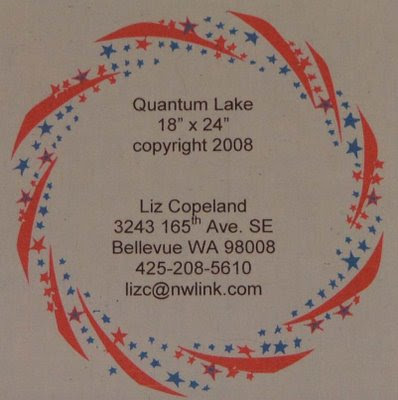
I do my labels in Word using ClickArt from Broderbund to create the art around the label. Here's the 2 different labels I came up with for Quantum Lake so you can see what the end product is before I start talking about the details of the process. The backing fabric is various blue stars, so one version of the label is done on light blue fabric with stars around the text.


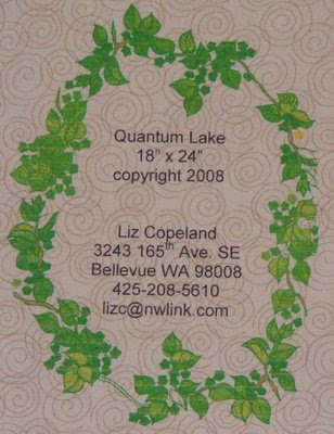
Quantum Lake itself has a combination of nature photos printed on fabric and a batik fabric that has spirals on it. So the second label echoes those design elements.


How did I create them? It's actually quite easy if you have some clipart borders available. The key thing to remember is that I create the text first in a Word document. Then I add the art that goes around it. I've never been able to edit the text once I add the art, so it's important to get the text done first. I often use a sans serif font because that's easier to read once it's been printed on fabric. I center the text, have the top line down about 2 inches from the top of the document so as to leave room for the surrounding border, and I generally size it at 18 or 20 for the font size. Once I've typed in the label text, I save the document so I can delete any art I add and get back to the basic text.

Next, I browse my clipart disk. Once I select a border or other art that I want to use, I insert the art by clicking on Insert on the top menu bar. I select Picture, and From File, then click on the image I want. (Side note: I got ClickArt 125,000 as a Christmas present years ago and have never felt the need to upgrade. There are several versions reviewed on Amazon and available for quite reasonable prices. ) Once I've inserted the art, I click on it and select Format, then select Picture. The options I always use are Behind Text, and Center because I center my text. Invariably, the art is the wrong size, so at this point I click on the lower right corner and drag it the right size. Then I reposition it if needed. If I like the result, I save the file and I'm done. Otherwise, I delete the added art and go look for something I like better.

This time, I did 2 versions and I'm still deciding which will actually go out on the quilt. Total time today to create the 2 label files, fuse the fabric to wonderunder and print, then blog about it: 2 hours 45 minutes.

Tuesday, June 3, 2008

Practice piece for FM quilting

I have a couple of pieces in the works, one of which has already been accepted into a show and I'll post about that later. I'm still working on my larger piece, finishing the quilting with hopes of submitting it to Houston later this week. Last night, I did some practice stitching using spirals and 2 different types of thread. I wanted to use 3 different threads, but the Signature polyester, size 30, kept breaking even with the size 100 needle. The picture below shows the different background fabrics with the sulky variegated rayon on the left, and the Signature variegated cotton on the right. (The smaller spirals on the turquoise fabric on the top are different Signature cotton that I decided not to use because it was too red.)


I'll have to work on getting the spirals smaller which is not surprising. Due to my medical issues, I haven't done serious FM quilting in several years so there's lots of rust on these skills. But another couple of practice runs, and I'll be ready to step up the real piece. I'm still trying to decide which thread to go with when I start the quilting on the piece today. The rayon is prettier, but I don't want the background quilting to pop out too much as there's already some quilting elements on the quilt. And those elements are done using rayon so there's one part that says match the thread and the other side that says, use the less obtrusive thread to highlight the other figures. Decisions, decisions...